
What a 105-Person Registration Looks Like in a Matrix Doodle Poll: A Case Study
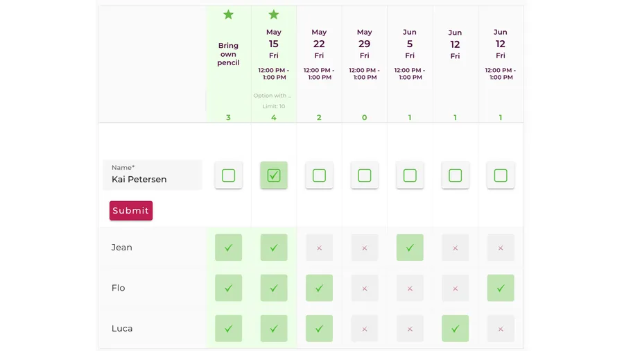
Most guides to scheduling polls stop at the small case: five people, three time slots, pick the row with the most green checkmarks. That’s where a Doodle-style poll starts, but it isn’t where it ends. Once you’re past a few dozen participants, the poll stops being a quick vote and becomes a registration system — a place where people claim a limited resource, where the layout you chose decides whether anyone can read the result, and where the small settings you flipped on day one quietly shape three weeks of responses.
We pulled one of those out of our database to look at. A registration poll for an event where each person could claim one spot, run as a table-layout Doodle poll, that collected 105 responses over about three weeks. We anonymized everything personal and walked through how it was built, because at this scale the configuration is the story. This is what a 105-person, table-format registration actually looks like from the inside.
A note on method. The structural numbers in this case study — 105 responses, the roughly three-week span between the poll’s creation and its last recorded activity, which features were turned on or off, the template and layout chosen — come directly from a real Whocan Doodle poll created in March 2026 by a host in the Central European time zone, for a large public event. No personal information, identifying details, names, event names, or contact data are reproduced. The narrative around the data (typical participant behavior, common patterns we see) is composite and representative of many similar registration polls, not a literal account of any single participant or exchange.
By the numbers
Here’s the skeleton of this poll before any narrative:
- Template: Doodle Poll
- Layout: Table (the matrix view, rather than the normal stacked layout)
- Theme: Custom (the host uploaded their own visual styling)
- Total responses collected: 105
- Days the poll was actively maintained: 21 (from creation to the last recorded edit)
- Time zone: Central European
- “Maybe” option: Enabled
- Public participant list: On — participants could see who else had signed up
- Contact collection: Email required
- Phone collection: Off
- Response deadline shown: Off
One structural detail sits behind all of this: the event allowed one spot per person. Not a headcount where you bring a partner and two kids — a straight registration where each participant claims a single place. That single rule explains several of the settings, and it’s worth keeping in mind as we go.
The matrix layout, and what it actually does
The first real decision this host made was to switch the poll into its table layout — what the setting calls the “Table” layout, as opposed to the “Normal” one. It’s an easy toggle to skip, and for a five-person poll it wouldn’t matter. At 105 responses it matters a great deal.
In the normal layout, each option is a block and participants stack underneath it. That’s readable when you have a handful of people and it keeps everything roomy on a phone. But as the participant count climbs, a stacked layout turns into a very long scroll, and the one thing you actually want to see — who took which slot, and how full each slot is — gets buried.
The table layout inverts that. Options run along one axis, participants along the other, and every response becomes a cell in a grid. You can look down a column and read one slot’s entire uptake at a glance. You can look across a row and see one participant’s full set of answers. For a registration where the whole point is “how many spots are left in each option,” that grid view is the difference between a poll you can actually manage and a wall of names.
This is the layout most people mean when they picture a “Doodle-style” poll — the dense availability grid. What’s easy to miss is that it’s a deliberate choice, not the default, and it’s the right choice specifically at this scale. A host running a small poll should probably leave it in the normal layout. A host expecting 100+ people should almost always switch to the table view before the link goes out, because it’s awkward to change your mind about it once responses are flowing in.
Why “maybe” was on for a reservation-style event
The second choice was to enable the “maybe” response. On the surface that looks odd for a registration where spots are limited. If someone can only claim one place, why give them a way to be non-committal about it?
Because reservation-style events produce a very specific kind of hesitation. When a slot is scarce, people don’t want to claim it until they’re sure they can use it — but they also don’t want to say a flat “no” and lose track of it, in case a plan firms up. Without a middle option, that hesitation has nowhere to go. Some people decline outright and never return. Others simply don’t respond, which is worse, because now you can’t tell the difference between “not interested” and “still deciding.”
The “maybe” bucket gives that uncertainty a home. In our data, on registration-style polls, the “maybe” column tends to fill early and then drain in the final stretch as people convert to a firm yes or release the spot. For the host, that column is genuinely useful information: it’s a rough forecast of how many of the still-open places are likely to get claimed versus freed up. On a poll where you’re managing a finite number of spots, knowing your “probably” count is almost as valuable as knowing your confirmed count.
Email only, no phone
This host asked every participant for an email address and left phone collection off. For a large public registration, that’s the logical pairing, and it’s a different calculation from what a small private event would make.
Email is the channel that scales. If you need to reach 105 people — to confirm their spot, to send a change of details, to tell them the plan moved — you send one message and it lands in 105 inboxes. Phone numbers, at that scale, are a liability more than an asset: nobody is going to call a hundred people, collecting them invites privacy concerns you don’t need, and for a public event the participants often don’t know the organizer well enough to want to hand over a number anyway. Email is the polite, scalable default.
The absence of phone collection is as much a signal as the presence of email. It tells you the host expected to communicate in writing, in batches, to a group that was closer to “an audience” than “a circle of friends.” That’s the right read for a one-spot-per-person registration open to the public, and it’s a good rule of thumb generally: collect the contact channel you’ll actually use at the scale you’re operating, and don’t collect the one you won’t.
Three weeks of late voting
The poll’s recorded lifespan was about 21 days from creation to its last edit — much longer than a quick meeting vote, and the length itself is characteristic of the type.
Registration polls for scarce-spot events don’t fill the way a casual invitation does. A casual invitation gets a burst on day one and a long tail after. A limited-registration poll often does the opposite: a solid early wave from people who know they want in and grab a spot immediately, then a long, watchful middle where the remaining audience waits to see whether places are still open before committing. People check back. They see the grid filling. Some of them move from “maybe” to “yes” precisely because the visible participant list showed the event was real and filling up — which is one of the quieter reasons to leave the participant list public on this kind of poll. Scarcity that you can see is a stronger nudge than scarcity you’re told about.
That watchful middle is why the poll stayed active for three weeks instead of three days. The host wasn’t neglecting it; a registration is supposed to stay open and stay tended while spots remain. The last recorded edit near the three-week mark is most likely the moment the registration effectively closed — the grid full, or full enough, and the organizer’s job done.
The custom theme
One more setting is worth pulling out, because it says something about who runs polls at this scale. Instead of picking one of the ready-made visual themes, this host used a custom theme — their own styling on the poll rather than an off-the-shelf look.
For a small private poll, the built-in themes are the sensible choice: you pick one that fits the occasion and you’re done in a second. A custom theme is more effort, and hosts only reach for it when the poll is representing something bigger than themselves. A public event with 100+ registrations is exactly that case. The poll isn’t a casual message between friends; it’s the front door to an event, and it will be seen by people who don’t already know the organizer. Making it look like the event — rather than like a generic form — does real work at that scale. It signals the registration is legitimate, which matters when you’re asking strangers to hand over an email address and claim a spot.
It’s a small tell, but a consistent one: across our data, the polls that carry custom styling are disproportionately the large, public, one-shot registrations, and this one fits the pattern exactly. The host wasn’t decorating for fun. They were making a public-facing thing look trustworthy, because trust is what converts a visitor into a registration.
What this poll got right
Stepping back, the configuration is coherent in a way that’s easy to appreciate once you see all the pieces together. Every setting points the same direction: a large, public, one-spot-per-person registration where the host needs to read uptake at a glance and reach everyone in writing.
- The table layout was switched on before scale made it necessary, so 105 responses stayed legible instead of turning into an unreadable scroll.
- “Maybe” gave scarce-spot hesitation a place to sit, and handed the host a rough forecast of the still-uncertain places.
- Email, no phone matched the contact channel to the scale and the public nature of the event.
- The public participant list turned visible progress into a gentle nudge, which suits a registration that fills over weeks rather than minutes.
- Leaving the response deadline off fit an event where the real cutoff was “when the spots run out,” not a fixed calendar date.
- The custom theme made a public-facing registration look like the event it belonged to, which is quiet but real work when you’re asking strangers to sign up.
None of these are dramatic choices on their own. Together they’re the difference between a registration you can run calmly for three weeks and one that becomes a mess by the second day. The lesson isn’t “turn on every feature.” It’s the reverse: the host turned on exactly the ones a large table-format registration needs, and left the rest alone.
Run your own registration poll
If you’re organizing something where a lot of people need to claim a limited number of spots, the setup in this case study is a good template to copy: use the table layout so you can read uptake at a glance, keep “maybe” on so hesitation stays visible, and collect the contact channel you’ll actually use.
You can build one in a couple of minutes, free and without an account. If you’re weighing your options first, our write-up of the free Doodle alternative covers what a table-layout poll can and can’t do, and our Doodle review goes through the trade-offs in more detail. When you’re ready to pick dates or slots, the scheduling poll is the place to start.